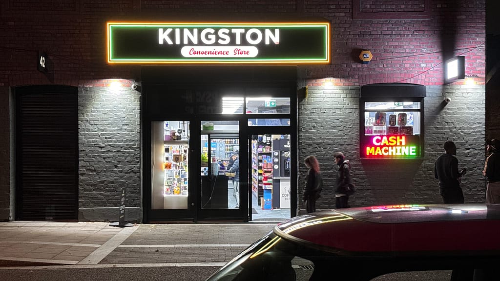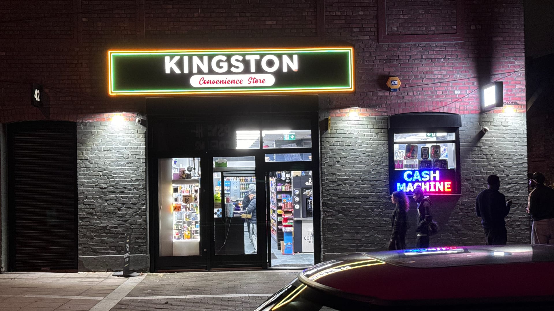
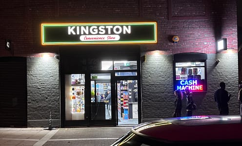
At first glance, the local corner shop seems far removed from the world of high art. Its function is purely practical—a place to grab milk, a late-night snack, or a newspaper. But look closer, and there’s a rhythm to the way these shops present themselves. The shelves, meticulously stacked with crisps, soft drinks, and sweets, create a vivid mosaic of colors and forms, arranged not just by product but almost unconsciously by design.
In their chaos, these displays form accidental compositions—rows of oranges and reds broken by bursts of neon greens and blues. From a design perspective, it’s almost sculptural. The repetition of shapes and brands speaks to movements like Pop Art, where everyday objects were transformed into icons. There’s something in the stacked pyramids of tins and the repetition of logo after logo that mirrors the same fascination with consumer culture.
An art critic might look at these displays and draw parallels to movements like Minimalism or Bauhaus, where form follows function, yet in the corner shop, the function becomes its own form of beauty. The interplay of colors and product placement is far from random—it’s an unconscious choreography of design, creating a visual language unique to the corner shop
Over the coming weeks we will begin releasing the first wave of images documenting this aesthetic. Welcome to Counter Culture – The Art of the Cornershop.